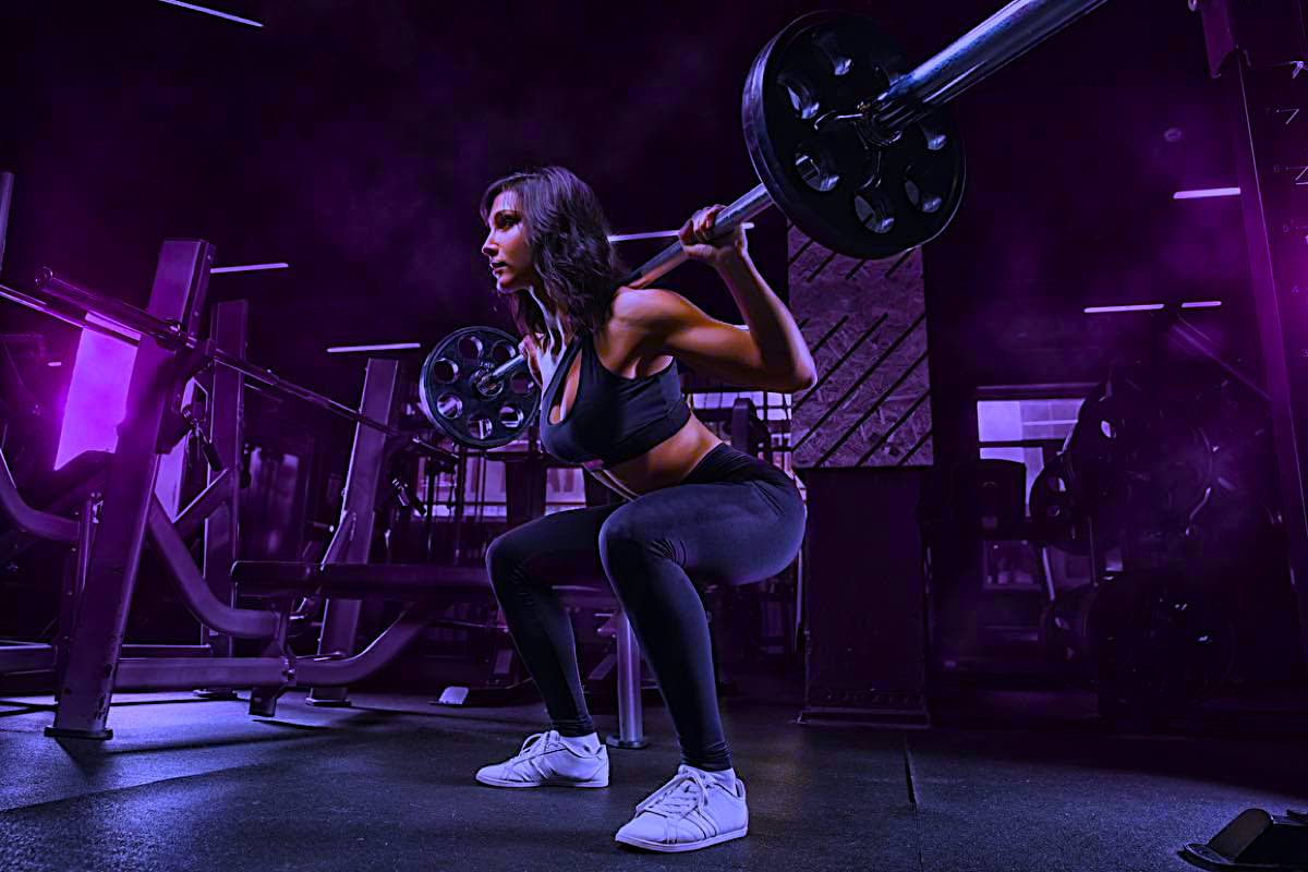
ThemeKit Gym Hero
A hero with an article which has the option of five custom animations and can be aligned left, center or right.
Parallax
The parallax scrolling is an option with a control to set the value of the effect.
View all the available themes and check back regularly for new ones.
Check out the ThemeKit Widget packs for professional, cutting edge widgets.
Add functions to a new or existing EverWeb. project
Create a new commercial website or up date and existing one.
This article stretches to the full width of the browser/device window. The layout can be switched and the text can appear above or below the image below the breakpoint.
Link
The active link can be inserted left or right and can be configured to open an internal or external page.
The list can be standalone or be displayed with an image.
A business website needs to have the contact info displayed upfront on page load.
Lazy Loading
All images and video files must be appropriately sized and have a lazy loading function. Content width images should be inserted with a separate smaller version of the image for mobile devices.
Hero
A hero image must have the image inserted in three sizes in the foreground rather than the backgound which prevents the inclusion of an alt text atribute.
Parallax
Parallax should be avoided on responsive pages unless there is a way to turn it off for mobile phones where it just creates confusion.
The exception is perhaps to use parallax for the landing page hero. The ThemeKit Hero PX widget is a custom design to allow it to use images inserted in a <picture> element so that alt text can be added.
The custom parallax script is a tiny jQuery function rather than a huge, complex script.
Page Download Performance
Download time and the time to become interactive must be under 2 seconds. Most websites don't even come close!
Follow the link below to find out if a web page passes Google's PageSpeed Insights test and why you don't really need that annoying cookie warning!
A jumbtron is used to draw attention to an important item. This design goes upscale by having the option to have a two color gradient background or an image inserted in three sizes with a lazy loading function.
Links
The jumbotron can have one internal/external link and an option to add another internal link with lots of styling options.
The height is adjusted usimg a slider that adds a percetage vertical padding.
Contact info must be clearly visible on page load and also be present at the bottom of the page and not hidden in a footer.
The ThemeKit Gym Contact Bar widget has an icon link, optional phone number/phone function and a spam protected email function.
It is inserted immediately below the home page hero item so that it is visible on page load.
The link in this case opens the contact /location info page.
A traditional horizontal navigation with or without dropdowns has proved to be inefficient for responsive websites. The navigation should be vertical for the best results in getting visitors to click through to other pages.
Mobile
Avoid using a mobile navigation with the action tab at the top left or right. Mobile users make up over 60% of the visitors so the action tab must be in the bottom half of the screen for their convenience.
Sections
On larger sites with directories a dropdown navigation just creates confusion.
Use a section nav to navigate the directry and a vertical page nav on the directory pages with a home link to go back to the section navigation menu.
A large footer as seen on most websites is a complete waste of space and an inconvenience for mobile device users.
Most of the info in these giant footers is never read and the contact info is not easy to find.
Replace the footer with a show/hide footer bar like the one at the bottom of this page.
Insert a link in the navigation to a page with the "fine print" and terms & conditions.
Follow the link below left for a description.
If a footer is really necessary follow the link below right to see how to do it right for a responsive website.