Responsive Image
Any content width image on a responsive web page needs to be inserted in at least two sizes - if not three. If the image is to be properly indexed by the search engines it must have alt text and be inserted in an HTML5 <figure> element along with a <figcaption>. The figcaption should include the image title and a text description.
Images
Content width images in a responsive website need to be inserted in two sizes and be lazy loading if they are not in view at page load.
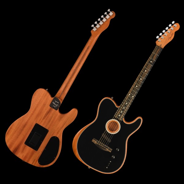
The image above was resized and optiomised before import into EverWeb. The images are 960 x 640px (63KB) and 600 x 400px (33KB).
Styles
The definition of an image can be improvide in most cases by adding a 1px border to separate it from the background.
Adding a box shadow to the bottom edge helps to lift it off the canvas and can be achieved by using a negative spread radius.
SEO
Using the figure and figcaption elements effectively lets the search engines know that the text info is related to the image.
Link
When an image is comfigured as a link on a responsive web page it needs an icon to let mobile device users know that it is a link. In this case the icon appears at the top right and animates on hover.


