Responsive Row Image Overlay

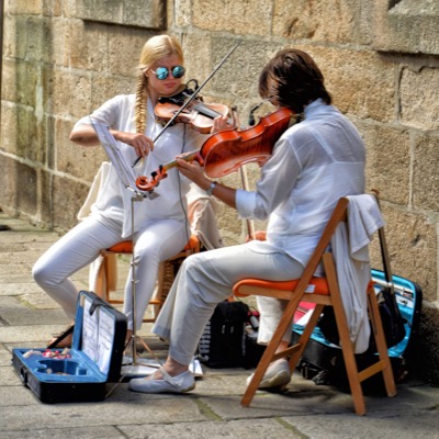
Image Overlay
A responsive row with 2, 3 or 4 images. The overlay can appear on hover on computers and on load when viewed on touch devices.
The image can be configured as a hyperlink and the overlay shows an icon to indicate that it is a link.
The caption can run to two or more lines and can be vertically aligned at the top, center or bottom.
Animation
The row has the option to have a staggered slide up animation when the item appears in the viewport.
Row Info On Click

Grid
Slide down info overlay on click or tap. Any overlay can be open on page load.
Opening another closes the previously opened one.

Item Spacing
The grid item spacing is easily adjusted using the grid-gap property and grid padding.
Image Row
Overlay
The overlay is triggered by clicking the chevron down icon which changes to chevron up when the overlay is open.
Row [3]
Items
The overlay has a heading, text and an optional link in a vertically centered container.
Row [4]Info Overlay
The info overlay has a chevron down icon that opens the overlay on click. The icon then reverses and closes the overlay on click or tap. When an overlay is open it will close if another one is opened.
The row can have 2, 3 or four images. When three images are presnt checking a box will cause the last image to center itself in row 2 on screen widths below the break point.
The optional staggered slide up animation occurs when the item enters the viewport.
Testimonials & Quotes
CSS Grid is the best way of creating layouts on the web. For the first time ever we have a proper layout system available natively in the browser.
If you compare it to the popular framework Bootstrap, not only can you create layouts that previously weren’t possible without introducing JavaScript, but your code will be easier to maintain and understand.
Roddy McKay
CSS Grid Layout is the most powerful layout system available for web design. It is a 2-dimensional system, meaning it can handle both columns and rows, unlike flexbox which is largely a 1-dimensional system and can only handle rows.
Grid Layout works by applying CSS rules both to a parent element - the Grid Container - and to the element's children - Grid Items.
Chris Coyier
The people who are crazy enough to think they can change the world are the ones who actually do it.
Creativity is finding the connection between things that others can't see.
Anybody can have a great idea but it only exists in the ether until a creator connects it to reality by putting it into practice.
A Anon
Block Quotes
Quotes from other sources should be enclosed in <blockquote> tags. In the item above the quotes are in these tags and also have the option of using a Google hosted font to create fancy quotes to enclose the text.
In the example there are three Google hosted fonts - Stint Ultra Expanded for the text Coustard for the quotes and Quigley for the signature.
The heading above the quotes is optional as is the internal link to more quotes or info.