Lightbox Slideshow
The image can be positioned left of right and the text can be above or below it on screen widths below the break point. The image has an optional cale on hover animation.
Caption Styles
The default style for the slide captions is font family Verdana, font size 15px and font color #FFFFFF (white). By checking a box, the caption font will inherit the font family set for the grid overlay and it has its own controls for font size and color.
Images
The slideshow images are responsive up to the width of the image file and are lazy loaded. There is a checkbox to allow preloading of the previous and next images for a better viewing experience.
There are checkboxes for removing the overlay and to disable right click.
Size
The slideshow images can be of varying size and aspect ratio. There are controls for adjusting both the width and the height ratio to compensate for images with very high or low aspect ratios. The range of the sliders is from 80 to 99%. The default setting is 90% for both sliders.
Scale To Ratio
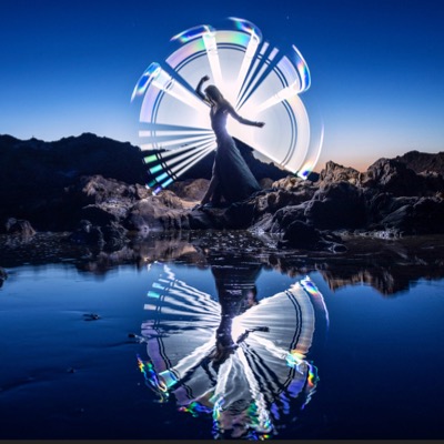
Checking this box will scale up images to the ratio set by the width and height ratio controls. For example, a tall, skinny image like slide [5] will fill the viewport height if the height ratio is set to 99% but the caption will not be in view if its position is set to "outside".
Navigation
The slider is navigated using directional arrows, grab and drag or keyboard arrows on computers and by swiping on mobile devices.
The "fade" transition can be changed to "slide" and the transition time is set in milliseconds.
The optional slide counter appears at the top left.


![Slide [1]](ewExternalFiles/beach-1200.jpg)
![Slide [2]](ewExternalFiles/sbx-1.jpg)
![Slide [3]](ewExternalFiles/sbx-2.jpg)
![Slide [4]](ewExternalFiles/sbx-3.jpg)
![Slide [5]](ewExternalFiles/sbx-4.jpg)