Images
Lazy LoadImages have alt text, a caption and a lazy loading option.
Flip Image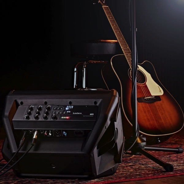 i
iImages have alt text, a caption and a lazy loading option.
Flip Image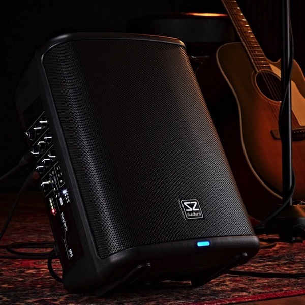 i
iHeading, optional span, text and an optional link - internal/external.
Flip Article i
iHover rotate 20° on computers width flip 180° X or Y on click/tap
Card GalleryThe flip items on the preceding page - article amd image - have a click to show and click again to hide the backface.
When two or more items are inserted in a row or grid the amount of user insteraction required can be reduced a lot by clicking on another item to hide the backface of the previously vieweditem.
Layout
The ThemeKit UI Cardds widget can insert two, three or four items. The items can form a responsive row or be inserted as a 2 x 2 grid by inserting four items and selecting [2] for the number of items.
There are separate controls for adjusting the grid column gap and the row gap.
The items have …
Like the other ThemeKit UI widgets the flip items use external, minified stylesheets to reduce the quantity on internal styles.
The Javascript to create the flip action uses a single line of custom code to improve performance on mobile devices.
 i
iCSS grid layout module with adjustable column gap.
Flip Image i
iImages have alt text, a caption and a lazy loading option.
Flip Article i
iInfo icon, caption, controls for border with, color &a,p' radius.
Card Grid i
iHover rotate 20° on computers width flip 180° X or Y on click/tap.
Search Grid i
iItems per row set for each device type.
Image Grid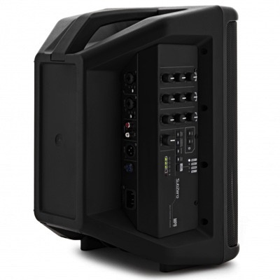 i
iHover rotate 20° on computers with flip 180° X or Y on click/tap.
Info Cards