Hero Header
The logo and h1 heading are placed at the bottom to allow for the 2 level Top Nav to overlay at the top.

The logo and h1 heading are placed at the bottom to allow for the 2 level Top Nav to overlay at the top.

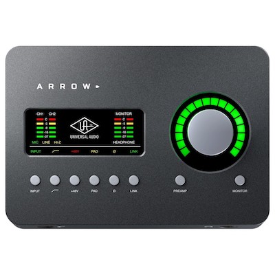
When viewed on computers, the product image gallery is positioned to the left with the thumbnails below. The description is to the right and has a heading and a paragraph for describing the product. This text can be aligned at the top, center or bottom.
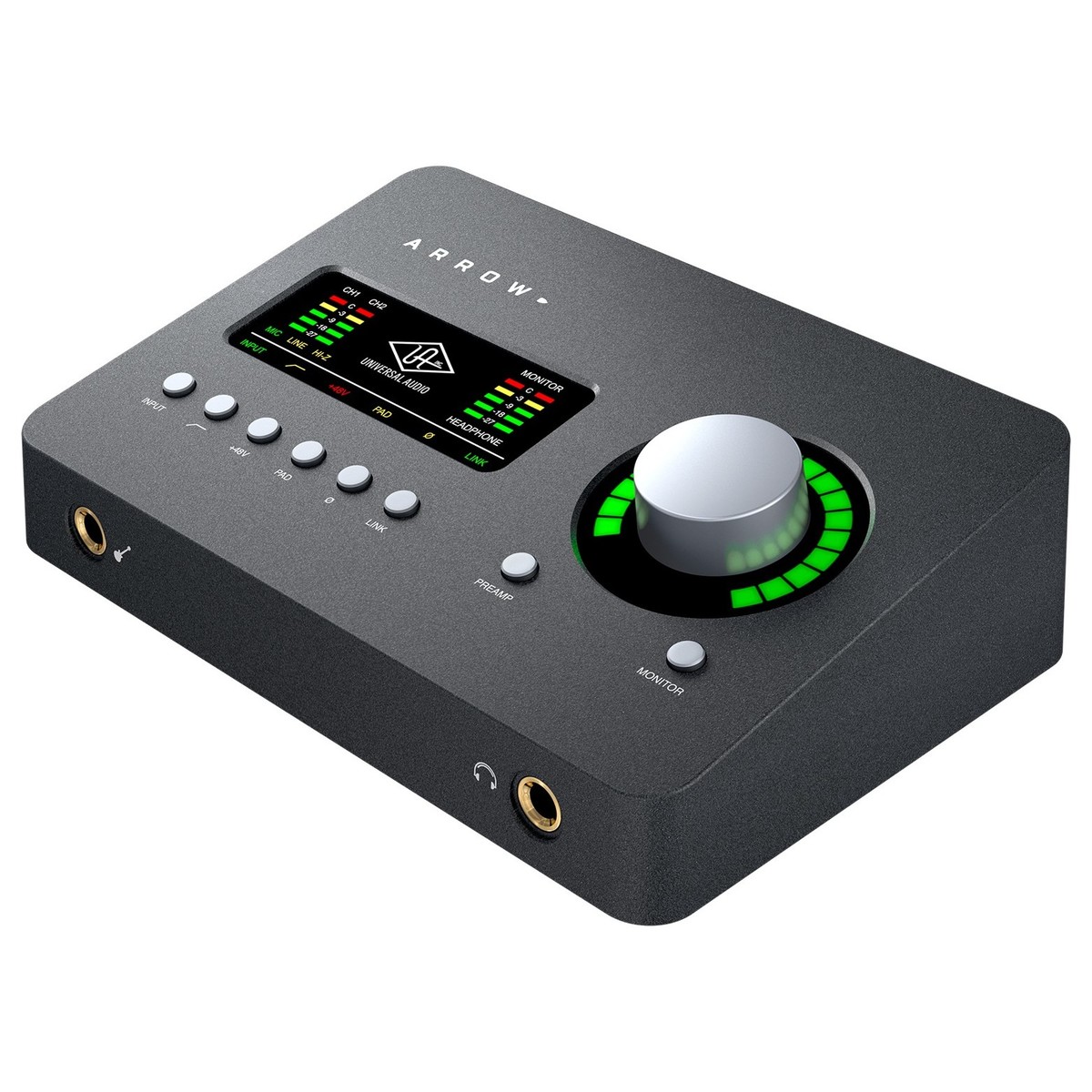
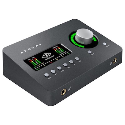
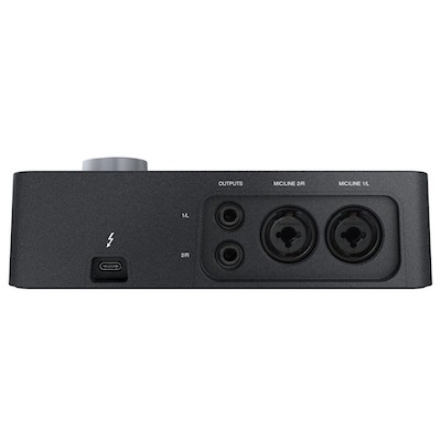
Hovering a thumbnail opens the larger image in the gallery stage.
The slideshow stage is set to a percentage of the maximum width - in this case 50% - and the text occupies the rest of the space.
Mobile
On mobile devices, the gallery is full width, responsive and the description slides below it.
Images are opened in the stage by tapping the thumbnails.
The number of thumbnails per row can be set and there is an option to set a lesser value when the item is viewed on a mobile phone.
Both the stage image and the thumbnails can have a border to separate them from the background if required.
The grid shows four items per row on wider screens reducing to two and then one on narrower devices.
Each item has an icon link with optional scale animation, a heading and text.
Each item has a slightly longer delay than the one on its left to stagger the slide in.
Animations can be set to fire once or every time they enter the viewport and defeated on mobile phones if required.
If viewing this page on a computer, reduce the browser width to see how the layout changes. More realistic results can be obtained by opening the page in both an iPad and an iPhone in the iOS Simulator.
This page is created using these items…