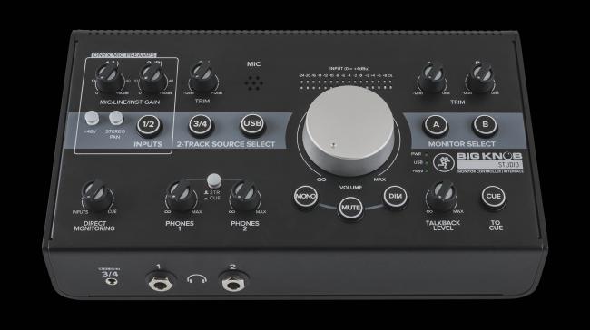
Front View
The grid is created using the CSS Grid Layout module.
The grid is created using the CSS Grid Layout module.
Note how grid items with different amounts of content automatically maintain equal height without using Javascript.
The links have absolute positioning and sit at the bottom of the grid items to stay inline.
The line is drawn around the link tab when the item enters the viewport.
The animation draws a line around the link tab - either on page load if the item is in the viewport or on scroll when the item scrolls into view.
Nowadays this effect is very often created using SVG animation which is fine for irregular shapes but is rather complicated for inserting using an EverWeb widget.
This animation is created using CSS and then implemented with javascript. The javascript is used to start the animations when the item scrolls into view. It can be set to run only once or every time the item scrolls into view. It can also be prevented from occuring when the page is viewed on a mobile phone if required.
The responsive grid layout allows for up to 48 items. The number of items per row can be adjusted for each device type - computer, tablet landscape, tablet portrait and mobile phone.
The grid gap, column gap and the padding are adjustable and the grid items can have a contrasting background.
Headings
The headings are optional and can have a contrasting background as shown in this example.
Images
The image size should be kept down if there are going to be a lot of them. An image width of around 400px is wide enough. The images have an alt text attribute.
Text
Since this a CSS Grid Layout, even although each item has a varying number of lines of text, the height is automatically equalised without the need to resort to Javascript.
Links
The link tabs are positioned absolutely at the bottom of the grid item so that they all remain in line despite varying amounts of text content. The line width, color and hover color can be adjusted and the animation time is set in milliseconds. The animation time can be set at a different value for each link if required.
Grid Items
The grid items can have a border and/or a box shadow and rounded corners if required. The number of items per row is set for each device type - computer, tablet in landscape mode, tablet in portrait mode and mobile phone.
Container
As with most of the responsive grid layout widgets, the info grid is centered within a wrapper with a maximum width setting.
The wrapper itself can be given a solid or transparent color depending on whether it is being used as a scroll over item - or not.
The container has a control for adjusting its spacing in relation to the items above and below it.
Now that we can create responsive layouts with items using relative rather than absolute positioning with EverWeb, items that vary in height are now possible.
The auto typing feature on this page has a control for speed and can be set to loop if the purpose is to drive visitors crazy!