EverWeb Widgets

Grid Layout Slide Over

The widget creates a text block with a heading, text , optional link and an image. They sit side by side when viewed on computers with a fixed height.
On tablets, the text slides over the image and has a transparent background.
On mobile phones in portrait mode, the image fills the height of the screen.

grid layout slide over

Slide Over

When viewed computers, the text block and the image sit side by side. At the break point, the text block slides over the image with a transparent background.
The image can be situated to the left or right and has responsive width and fixed height. When viewed on mobile phones in portrait mode, the image becomes viewport height and fills the height of the device window.
Item Relative Width
Since the CSS Grid Layout Module is being used, the items can be set to occupy any number of columns.
If both the text block an the image are each set to span one column, they will each occupy 50% of the width.
If the text block is set to occupy 2 columns and the image three columns, the text will occupy 2/5 or 40% and the image 3/5 or 60%.
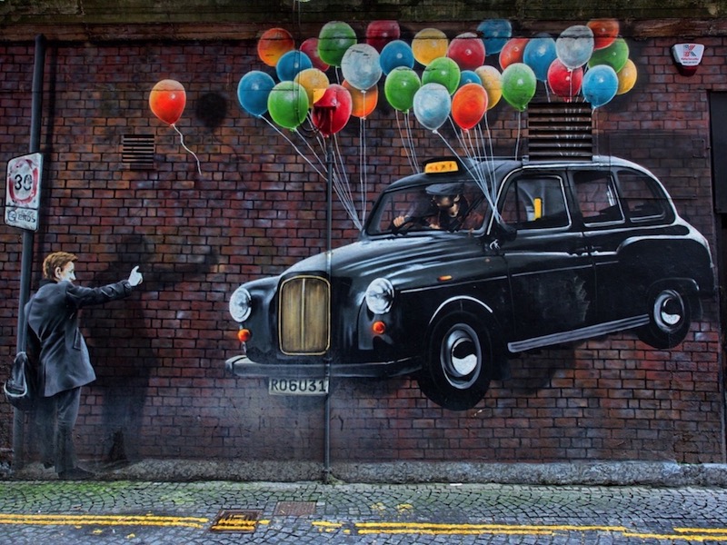
Image
The image has an alt text attribute for entering keywords for the search engines and should be cropped to the required size before importing into EverWeb.
The actual size will depend on the maximum width of the Slide Over widget, the relative with of the image and the break point at which the image becomes full width. An image width of about 800px should be wide enough for most purposes. The height should be around the same height as the widget's height setting.

Setup

The text area has controls for setting a web safe font or a non websafe or Google hosted font with a websafe fallback. It is vertically center using the CSS grid align-self property.
The heading has controls for setting the font size and text align and has the same font color as the text.
The text has controls for font size, color and line height.
The background setting is for a solid color and the overlay background has controls for both color and opacity.
The text content has controls for adjusting the left/right padding and another for setting a different value when viewed on mobile devices where the maximum width is set at 600px.
Link
The link is optional and can be configured to open an internal or external page and in a new window if required. It has controls for font size, color, hover color, border width, color and radius and top/bottom and left/right padding.
Break Point
The Break Point is the browser or screen width at which the layout change takes place. The options are for 1059 (tablet landscape), 799 (tablet Portrait or 739 (mobile phone portrait mode).

Wrapper

Where aplicable, all the responsive widgets create by EverWeb Widgets have a wrapper. This has 100% width and controls for setting the background color and its opacity.
The wrapper has two purposes …
[1] To provide an overlay when the widget is used on the same page as a widget like a hero image which can be fixed in position to allow the items below it to scroll over.
[2] To allow top/bottom padding to be added to space the item vertically from the items above and below it.

© EverWeb Widgets -