ThemeKit Carousel

Image Carousel [1]

Image Carousel

Items

Items to show and items to scroll for each device type.

Video
Item Content

Content

Options

The text content area has a heading, optional span, text and an optional link.

Vimeo
Links

Links

Links can open internal or external pages and have a new window option.

YouTube
Arrows

Navigation

Arrows

Arrows can be made to show/hide for each device type.

Hero Image
Images

Images

Images have alt text and an option for a border.

Gallery
Height

Items

Height

Items can be given equal height by setting the minimum height control to a suitable value.

Designer Slider

Carousel

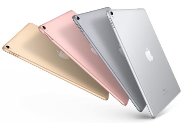
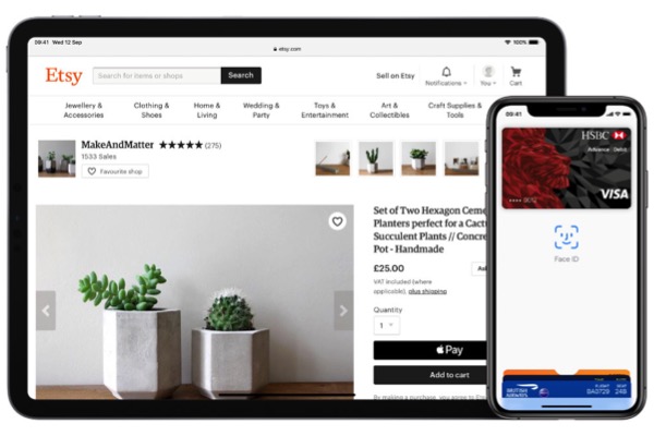
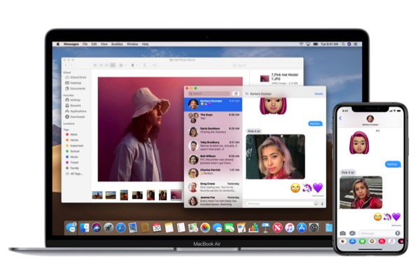
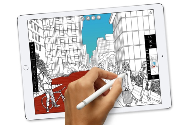
The carousel was design to show off products. It has images with alt text, a heading, anoptional span for price/date/sub heading, text and an optional bar link at the bottom. The slides have a minimum height setting to preserve equal height with varyinf text content. There are controls for slide spacing and the slide transition time.
Navigation Arrows
The arrows sit outside the slide container and will disappear on touch devices where the slides can be swiped.
Carousel Options
The number of slides to show, the number of slides to scroll and show/hide arrows can be set for each device type - computer, tablet landscape, tablet portrait and phone.

Content Fade In

Adding a fade in animation to the page content on load gives a very smooth transition and helps to nullify the effect of large images taking time to appear.
The simple widget used here can be inserted anywhere in the stack of widgets on a responsive page template. It has controls for height, background color and opacity, animation time set in milliseconds and a checkbox to turn it on.
The widget can also be used as a spacer by increasing its height and setting the background opacity to zero.
In this demo, the height is set to 24px and the background color set to solid blue so that it can be seen.