ThemeKit Hero Fixed
Content Scrolls Over
Hero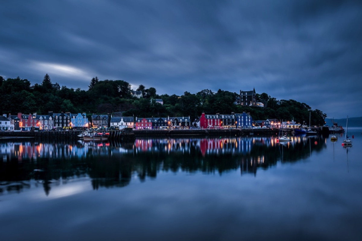
The navigation has inline block links on browser widths above the breakpoint and switches to a mobile dropdown opened by a tab with a " hamburger" icon. As can be seen from the example the background can be a two color gradient with options for opacity and gradient angle.
Logo
The logo is optional and can be configured as a link to open an internal page. When the logo is present the navigation links are aligned right. When there is no logo, the links are aligned center.
Links
The links have settings for minimum width, horizontal and vertical spacing and background color with an opacity slider which can be zeroed to show just the main background.
Current Page
The navigation can indicate the current page with a different color from the other links and has the option to add an animated underline.
Mobile Icon
The icon is an SVG so that its color can be easily changed. It is positioned at the top right and has controls for color, background color and opacity, position X and Y, border radius and a padding control to adjust the size of the icon.
There is a checkbox to fix the position of the mobile navigation if required.
Mobile Dropdown
The mobile dropdown navigation has controls for width, background color and opacity and separtor width and color.
Position
When viewd on browser/screen widths above the break point the navigation can be positioned in three ways …
Relative allows the navigation to scroll with the rest of the page content.
Absolute allows it to overlay the top item and scroll with the page content.
Fixed sets the navigation to overlay the top item and remain in view when the page is scrolled.
The hero image is fixed in position so that the content below scrolls over it and gives the imapression of a background image without all its disadvantages. The image can have a fixed height or be set to fill the browser/device screen viewport. On mobile phones in portrait mode the image becomes full height to fill the screen on page load.
Images
The images used in the demo were resized before importing into EverWeb. They are 1200 x 800 600 x 400px and the mobile phone image has an aspect ratio og 9:16 with a file size of only 60KB uncompressed.
Overlay
The image overlay has controls for background color and opacity. It has a heading and text and an optional link. The link can open internal or externalpages and has a new window option.
Animation
The overlay has the option to have a fade in animation with controls foranimation time and delay set in milliseconds.