Responsive Navigation
Mobile device users make up over 60% of the visitors to most websites and yet the vast majority of designers don't seem to think consider them when deciding on the most essential feature - the navigation.
Mobile device users make up over 60% of the visitors to most websites and yet the vast majority of designers don't seem to think consider them when deciding on the most essential feature - the navigation.
The ThemeKit Thumb Navigation was designed to show a conventional navigation when viewed on computers and switch to an action tab in the center at the bottom of the device's window for easy reach with either thumb.
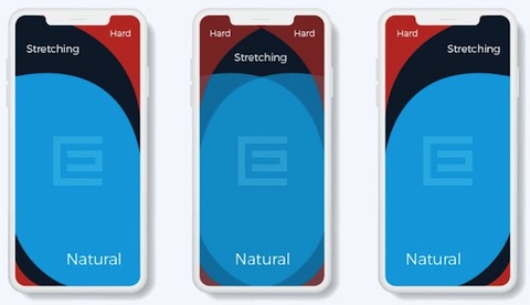
The navigation links open over the content and are centered horizontally and vertically. A vertical navigation has proven to be much more effective than a horizontal one for getting visitors to click through to other pages of the site.
As a matter of interest the most ineffective menu is a horizontal one with dropdowns and should be avoided if possible.
Current Page & Scroll
The thumb driven nav has an animated background change on hover and the current page link can indicated by using a different background color.
At first sight the navigation appears to be limited in terms of the number of links since it has a fixed position when viewed on touch devices. However, if the number of links excedes the viewport height of the viewing device, any overflow will scroll into view - using a thumb of course!
Apart from hooking visitors with a well designed hero item with a call to action, the next most important feature on any web page is contact information.
It's surprising how many websites make this really hard to find or tuck it away in a large, untidy footer with all the other stuff that nobody cares about.
Research has shown that most visitors immediately distrust a website if they can't see the contact info upfront.
Contact info should be placed either in the header or in a toolbar that is easily seen and conveient for mobile device users.
The ThemeKit Contact Toolbar widget can be placed below the header, overlay the bottom of the hero item and/or immediately above the footer.