ThemeKit Lite Theme

Text & Image Content

ThemeKit Lite Text Wrap

Text wrapping an image is kind of outdated but it can still be usefull for breaking up large chunks of text and for inserting an image at less than content width which avoids having to insert a smaller image for mobile devices.
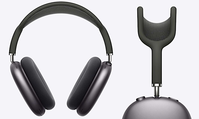
ThemeKit Lite Text Wrap

Text Wrap Image

The main text is divided into two paragraphs, The first one is displayed on all devices and the second one has the option of being remove for phone users to help reduce the amount of vertical scrolling,
Image
The image has alt text, a percentage width slider, a maximum width control and a lazy loading option.
Below the breakpoint the image becomes full width.
The image has controls to add a border, to adjust the gap between it and the text and to adjust the text spacing from the bottom of the image the image. This is used in conjunction with the text line height control to achieve the best result in the appearance of the image and the wrapped text.

Extra
This is the extra text block which has the option of being hidden on mobile phones.
The optional CTA call to action) style link can open internal or external pages and has a new window option.

ThemeKit Lite

Content Grid

ThemeKit Lite Grid 1

Grid

Auto

A grid layout using the min-max function and the auto-fill keyword to create a responsive grid without using media queries

Home
ThemeKit Lite Grid 2

Grid Gap

Column & Row

Items in the grid can be spaced out evenly by giving a value to the grid-gap property.
The grid-column-gap and grid-row gap properties can be used if the columns and rows need different spacing.

Content
ThemeKit Lite Grid 3

Align

Vertical

Grid items are aligned vertically using the align-items property, The default value is "auto" which makes all the grid item heights equal despite varying content.

Images
ThemeKit Lite Grid 4

Align

Horizontal

Grid items are aligned horizontally using the justify-items property.

Gallery
ThemeKit Lite Grid 5

Flexbox

Grid or Flex

Grid is a lot more versatile than Flexbox but there are situations where it can be combined with grid.

Video
ThemeKit Lite Grid 6

Links

Position

The links are positioned at the botttom of the grid item very simply by using flex and auto margins

Slider

Navigation Menu

The ThemeKit Lite Nav Menu has an action tab to open a full size overlay with the navigation links centered horizontally and vertically. The navigation can have any amount of links. When the number of links exceedes the viewport height any overflow will scroll.
Links
The links can be separated and have a background hover animation.
The current page link can be displayed with a different background color.
Action Tab
The action tab is fixed at the top right when viewed on computers and has the option to become vertically centered on tablets and phones to make it easier for mobile device users to reach.
The tab displays a navigation icon on load and a close icon when it is opened. There is an option to add text to the action tab to describe its purpose. The text is removed on mobile devices.

Info

Sidebar

ThemeKit Lite Sidebar 1

Main

The ThemeKit Lite Sidebar widget has a grid layout with one or two columns. The main column is an HTML5 <article> and the sidebar is an <aside> element.
This main section has a heading and text and options for an image with alt text and an internal/external link.
Below the breakpoint the sidebar content is below the main article.

Gallery