ThemeKit Lite Theme

Slideshows

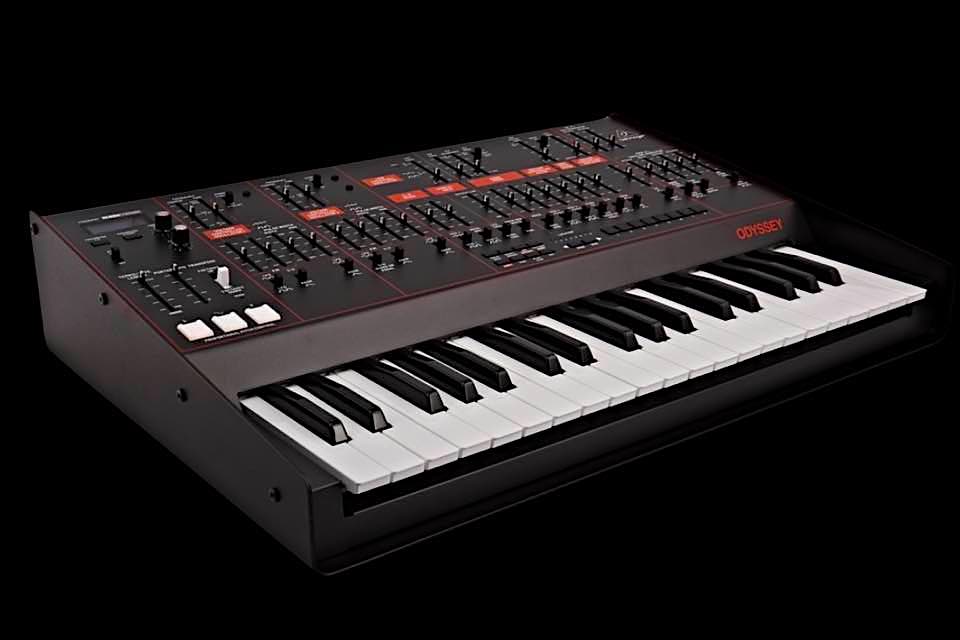
ThemeKit Lite Slider 2 1
Responsive Slider
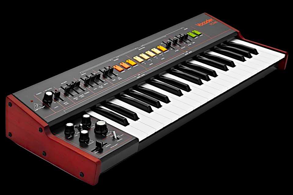
ThemeKit Lite Slider 2 2
Optional Links
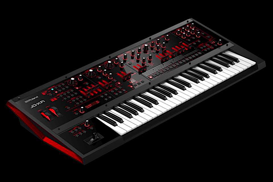
ThemeKit Lite Slider 2 3
Image in 3 Sizes
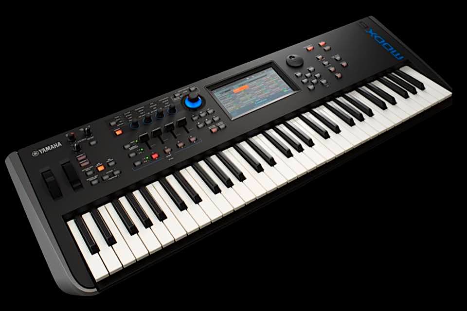
ThemeKit Lite Slider 2 4
Lazy Loading

Lite Slider [2]

If a slideshow is content width it must load a smaller image file for mobile devices and lazy load the images.
Adding the option for a portrait or square image gives a much better user experience on mobile phones in portrait mode.
The images in the demo were sized to 960 x 600px (40KB), 720 x 480px (30KB) and 375 x 375px (25KB) and optimised before importing into EverWeb.
The slider has the previous/next controls grouped together for the convenience of computer users. The controls can be hidden at a preset breakpoint on mobile devices for swiping.
The slide transition can be fade or slide and the transition time is set in milliseconds.
The link option shows an icon at the top right. Captions and icons can appear on hover on computers.
Slideshow + Article

ThemeKit Lite Slider

A responsive slideshow with the option of a single column or a two column grid.

Gallery
ThemeKit Lite Slider 1
Captions on Hover
ThemeKit Lite Slider 2
Autoplay Option
ThemeKit Lite Slider 3
Pause on Hover
ThemeKit Lite Slider 4
No Autoplay on Mobile

Lite Slider

If a responsive slider is full width it must have the ability to display three sizes of each slide image for the various devices. If it is content width it must have two sizes of the slide image available.
If a slideshow can only display one version of the image it must be no wider than 800px, be optimised and lazy loaded.
The ThemeKit Lite Slider can either display an image at a width up to a maximum of about 800px or a smaller image in one column with a heading, text and an optional link in the other
Autoplay
Autoplay is not desirable in any situation as it is irritating and takes control away from the visitor.
If autoplay is used the slider should have a pause on hover function and the autoplay should be removed for mobile devices.
The ThemeKit Lite Slider has the option to defeat the autoplay and a control to set the breakpoint at which this happens.
Slide Transition
Above the breakpoint the slide transition can be fade or slide. Below the breakpoint the transition is slide which is better for swiping. The previous/next arrows can be hidden on mobile devices if required.

Slideshow No Article

ThemeKit Lite Slider 1
Image Slideshow
ThemeKit Lite Slider 2
Image Width 720px
ThemeKit Lite Slider 3
Optimised Before Import
ThemeKit Lite Slider 4
Autoplay on Computers

Lite Slide - No Text

In this example the slideshow is set up without the article. Its maximum width setting is 720px and the images were sized to 720 x 480px and optimised before importing into EverWeb.
Autoplay
Autoplay is set for computers but is remove for mobile devices. The captions show on load and the arrows are set to show on hover/pause.
Use Preview.app to reduce image file size and the freeware ImageOptim to optimise JPGs and PNGs.

ImageOptim

ThemeKit Lite List

The list has an optional heading and text and can have up to 48 items with custom markers. To add the marker …

  • Click the "Get Marker Code " tab in the widget settings

  • Find the require marker and double click it to open in a new window

  • Copy the CSS version of the code which will have a backslash at the beginning

  • Paste the code into the Link Marker box in the widget settings

  • Adjust the marker for size, color and spacing from the list item text

  • Check the box to add separators

  • Set the separator width and height

  • Set the separator color and style - dashed, dotted, double or solid