EverWeb Widgets

Animation

About Web Page Animation

Animation should be treated like any other effect and used in moderation. It should be used to draw attention to an item in a smooth and gentle way for professional results.
Demo Pages
The ThemeKit demo pages will have more than one animation on a page but this is not necessarily good pratice for normal website use. These are demos - not production pages.

ThemeKit Animations

The animations in the ThemeKit Animations widget pack either use the small custom stylesheet or a couple of lines of code in the internal styles to prevent them from causing download problems.
They will either fire on page load - as in the case of a hero item - or can be set to fire only once or every time the item enters the viewport.
Mobile Phone
In general it is rather dumb to animate items on pages that will be viewed on mobile phones. This practice is definitely not recommended as it will confuse vistors, prevent them from quickly finding the info they want and cause most of them to leave the site.
One exception is the hero item on the landing page. A well design and unique hero item with subtle animation can make a website more memeorable which helps to encourage visitors to return at a later date.

EverWeb Default Animations

The EverWeb default animations use the Animate stylesheet which has been around for a long time, has been done to death on thousands of webistes as is very much outdated.
The stylesheet weighs in at 53KB against the ThemeKit stylesheet which has a file size of 3KB.
The EverWeb animations require the whole stylesheet to be doenload by the brow even if only one animation is used.
The main problem with these animations is there doesn't seem to be any way to prevent them from firing when viewed on mobile phones. Apart from perhaps the hero item, it is not recommended to use animation on mobile phones since they are more likely to confuse the visitor than inform them.

Hero Images

Images for responsive pages must be resized properly and optimised before importing into EverWeb to achieve the best page download performance.

Animating Images

Size

Always assemble the images for a web page in a Finder folder. Adjust them by opening in Preview.app to crop and/or resize to the maximum width that it will appear at in the browser.
If the image's maximum width is going to be set to 800px then resize it to that width.
Hero Images
A hero image is usually full width and fixed height. The image size required for good quality when viewed on a computer is far too large for mobile devices.
Crop/resize the large image to around 1200 x 800px.
Duplicate it, give the duplicate a suitable name, open it in Preview and use "Adjust Size …" from the Tools menu to reduce its width to 720px.
The file size of this duplicate will be about half the size of the large image.
Phone Image
A landscape hero image will just not work when viewed on phones in portrait mode.
Crop the main image to an aspect ratio of 9:16 and then reduce its width to 375px.
Retina
Smaller sized images tend to lack luster when viewed on a mobile phone - particularly if it has a "retina" display.
Do NOT be tempted to insert a retina @2x image. The average surfer will not notice the better quality and will not appreciate the increased page download time.
Saturate & Sharpen
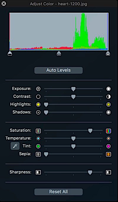
Double click the phone version of the image to open it in Preview, select "Adjust Color …" from the Tools menu.
Adjust the "Saturation" and the "Sharpness" sliders to around the 80% mark. For high speed editing don't drag - just click.
Now your image will look just as good as an @2x image to the untrained eye.
Content Images
If an image is inserted at the page content width it too will be far too big for mobile devices. Always use a widget that inserts a full size and a half size mobile version of the image.
For best results use a widget that inserts the images via the HTML5 <picture> element inside a <figure> with alt text and caption in the <figcatpion> element.
Optimise
Optimise the whole folder of images by selecting all the images and dragging them onto ImageOptim.app and you are done.
Effort
To the inexperiencced all this maight seem like a lot of extra work but it doesn't take much time with a little pratice and makes the differennce between a mediocre and a professional level website.

ImageOptim
ThemeKit Background Banner 1
ThemeKit Background Banner 2
ThemeKit Background Banner 3

Background Banner

A slideshow set in the background is not really a good idea for any web pagesign - especially a responsine one.
Viewport Slider
Inserting the slideshow to fill the viewport rather than the browser background prevents distirtion and increases the image quality dramatically.
This slider goes further by inserting the images in three sizesfor the various devices and using pure CSS rather than Javascript to drive it.
Images
The slider can show up to 12 images. The images in the demo were sized to 800 x 800px 600 x 600px and 375 x 666px and optimised before importing into EverWeb.
The images are inserted using the HTML5 <picture> element so that htey can have alt text for the search engines.
Controls
There are controls for setting the slide display time and for adding an overlay with an opacity slider which can be used to enhance the transition effect.