ThemeKit Reveal On Hover

ThemeKit Reveal Hover hero

Reveal Hover hero

Both the stage and the curtain images are inserted in three sizes to make the item suitable for responsive pages. The angle of the curtain meeting edges can be adjusted.
On touch devices the hover is replaced by tap to open and tap off the item to close.
This <article> can be aligned left, center or right.

Info
ThemeKit Reveal Hover Content

ThemeKit Reveal Hover Content

The overlay image slides open on hover on computers and on tap on mobile devices. Tapping outside the container will restore the overlay.
Below the break point the overlay image is removed and the content items stack.

Info

Reveal On Hover

When designing responsive pages it's important to remember that hovers ae of limited use since they don't work on mobile touch devices. Images, for example, should not be created as a link unles they can display a link icon on touch devices. Otherwise the visitor has no way of knowing that it is aa link.
Hovers can be used if there is an alternative way of creating the hover state for mobile device users.
When this page is viewed on a tablet or phone an icon appears. Tapping it will open the "cutrains" and tapping anywhere outside of the item will close them.
Images
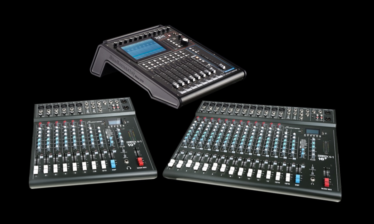
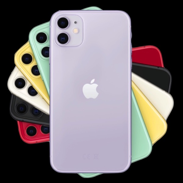
The animated overlay inserts the image in two sizes. In this case the large image is 1200px wide and the smaller one for mobile devices is 720px wide.
Curtain Angle
The angle at which the left and right "curtains" meet can be varied from approximately 45° left through vertical to 45° right using a slider.

Center Nav Menu

Reveal Center Nav

Research has shown that a vertical navigation is more likely to encourage click through to other pages than a horizontal oe.
The action tab for a menu that animates in should be at the top right on computers and at or near the bottom on touch devices.
The ThemeKit Reveal Center Nav does both.
Animation
The navigation and its background overlay animate dow when the action tab is clicked or tapped. The nav is centered horizontally and vertically. When the height of the nav is greater than the viewport height the links will scroll.
The link text can be aligned left or center and the hover background is animated to add a smooth, professional touch to the UX {User Experience).
Action Tab
The tab itselfhas controls for icon color, background color and border radius. The three horizontal bars animate to a close icon when the menu is visible.

Business Hours

Mon - Fri: 8am to 6pm
Sat - 9am - 5pm
Sun - by appointment

EverWeb Widgets

1200 Industrial Way,
Unit 231
Anytown
NZ 500913

© EverWeb Widgets -